
Tips and Best Practices
Here are some tips and best practices for college programs operating their own social media accounts.
Creating Social Media Accounts
Use One Account
Avoid creating multiple accounts for one program (on the same platform), because that can dilute your audience. Stick with one account, even if it’s been a long time since you last posted.
Have a Backup
Keep your passwords secure, but make sure two or three people in the department have credentials to log in – so they can still post and keep the account active when you go on vacation or change jobs.
Posting on Social Media

Keep It Short
- Don’t write multiple paragraphs. Long posts generally are less engaging.
- Summarize the most important information and link to a website that contains all the details.
Keep It Simple
- Don't use images that include a lot of words or complex visual elements.
- Your post should be easy to read by someone who is quickly scrolling through their feed.
Make It Engaging
- Tag people and groups that you mention by name, so they and their followers will see your post.
- Follow other accounts that are relevant to your program. It’s OK to occasionally retweet or share, when appropriate and with credit to the original source. This may encourage others to retweet or share your posts.
- Remember to monitor your account, so you can reply to students who might try to contact you with questions.
- It's fine to answer general questions ("When does registration begin?"), but move individual questions offline to protect the student's privacy. You can hide comments that contain personal info and encourage the student to call or email your office.
- Don't engage with trolls. Respect free speech but be ready to hide offensive posts or block someone who posts offensive material.
Use Common Sense
- You should always assume that everything you post is public, meaning it can be seen by anyone on campus, in the community and around the world.
- Your posts can reflect on the college, so use common sense to decide if your message is appropriate for a general audience.
- Watch out for phishing scams and imposters. Be cautious with official-looking messages from "Facebook" or any company about your account. Verify the message is authentic before you respond.
Make It Accessible – For Everyone
 An important part of equity is making sure that everyone has access to the information you are sharing – including individuals with visual or hearing
disabilities.
An important part of equity is making sure that everyone has access to the information you are sharing – including individuals with visual or hearing
disabilities.
- Emojis should be used sparingly and only placed at the beginning or end of a chunk of text (not in the middle).
- If you are going to use a hashtag, make sure to capitalize the first letter of each word. For example, #CapitalizeEveryWord.
- Always check the colors of any designed image to be sure the words can be read by people with different types
of vision.
- Your text color needs to stand out from your background colors
- Use a contrast checker to verify the color contrast of your image. (See below to learn how.)
- All images must have alternative text. This allows users to hear a description of the image if they use assistive reading software. For this reason, images should not have much text – if any at all.
- All relevant information should be in the text box of the post. Some people with vision impairments use assistive reading software that can't detect words in an image file. If you have more information to share, add it to a calendar event or webpage and link to that in the post.
- All videos must have open captions, for those who may not be able to hear the audio track. This means captions that appear on the video.
- All videos must have audio descriptions for anything that is happening outside of the dialogue. This means that a voiceover must be added to the video to describe what is happening. If this interferes with the dialogue, you can upload a separate, accessible video.
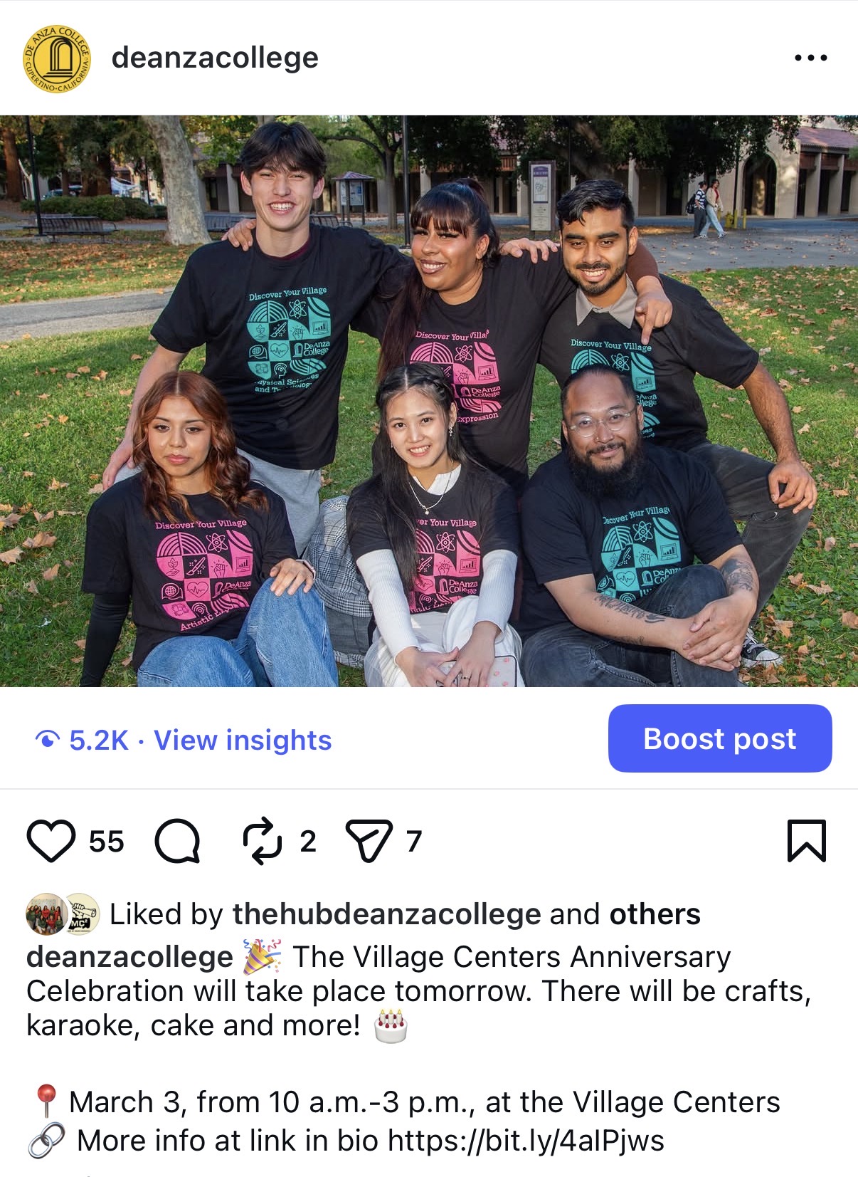
Get Consent
- Make sure that students have given their consent before you post any photo that shows them in a recognizable way.
- For individuals or small groups, ask them to complete the online release form.
- Do not post images you find on the internet unless you have permission from the copyright holder. (That’s usually the person who created the image or photo, not the person who’s shown in the photo.)
Plan Ahead

Posting fresh content on a regular basis – at least 2-3 times a week – is essential if you want to get views, gain followers and engage your audience. (Nobody wants to follow an account that hasn’t posted for several months.)
- Make a calendar so you can plan posts about relevant events and identify the gaps you’ll need to fill.
- You can always post something that’s not on your calendar, but planning ahead will help keep your account active.
Questions?
If you have any questions or want more assistance, contact the Office of Communications at communications@deanza.edu
You can follow us at
- Facebook: deanzacollege
- Instagram: @deanzacollege
- TikTok: @deanzacollege
- X (formerly Twitter): @deanza_college
- YouTube: @DeAnzaCollegeOfficial
How To Check Contrast
A contrast checker is an online tool that will tell you if your images are accessible to everyone. Here's how to use the WebAIM contrast checker, developed by a nonprofit organization based at Utah State University's Institute for Disability Research, Policy and Practice.
- Use your web browser to visit the contrast checker site. (It will be easier if you work on a desktop screen.)
- Reduce the size of your browser window so you can open another window with the image you want to check.
- Look for the Foreground Color section of the contrast checker.
- Click on the color box that is next to the box with numbers in it. This will open a box with a color scale and an "eyedropper" tool
- Click the eyedropper icon next to the colored circle.
- Use the eyedropper to select the color of your text in the image you are checking (in the adjacent window).
- Repeat the steps in the Background Color section to select the color of your background.
Acceptable results include a ratio of 4.5:1 for normal text and 3:1 for large text.
Exceptions are allowed if your design is purely for decoration and does not convey any important information.